

How can we improve access to COVID-19 documents?
Academic project, 2021
As vaccination rates rise, so does the risk of misplacing physical proof of COVID-19 vaccination.
💡
Concept
Masspass
To facilitate easy access to personal COVID-19 information and explore vaccine card alternatives.
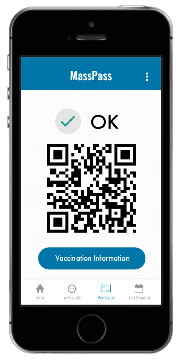
Vaccination Information
Scheduled PCR Test Confirmation
Logo & Button enhancements
Enhanced the ‘Masspass’ logo with bold lines for a distinctive look.
Ensured button uniformity to highlight the logo’s clickability.
Improved user guidance
After clicking ‘Confirm Appointment’, users receive immediate confirmation of their action’s success.
Expanded the main navigation to include a ‘Home’ button.


I met with other designers who were working on their own version of Masspass. They walked through the list of tasks and relayed any potential challenges with the current prototype.
Medium-fidelity Prototype

I tackled some UI design & information layout issues.
MY ROLE
Planning & Research
Design & Prototyping
User Testing & Analysis
Context
TImeline
Kelly Dang
Natalie Hsu
Samantha Liu
Alex Ma
In Massachusetts, vaccinated residents receive a physical card as proof of their COVID-19 vaccination. Losing this card could complicate access to places with vaccine requirements.
Seeing how easily physical vaccination cards could be misplaced, our team explored ways to make COVID-19 documentation more secure and easier to navigate in our Human-Computer Interaction course.
3 months
TEAM
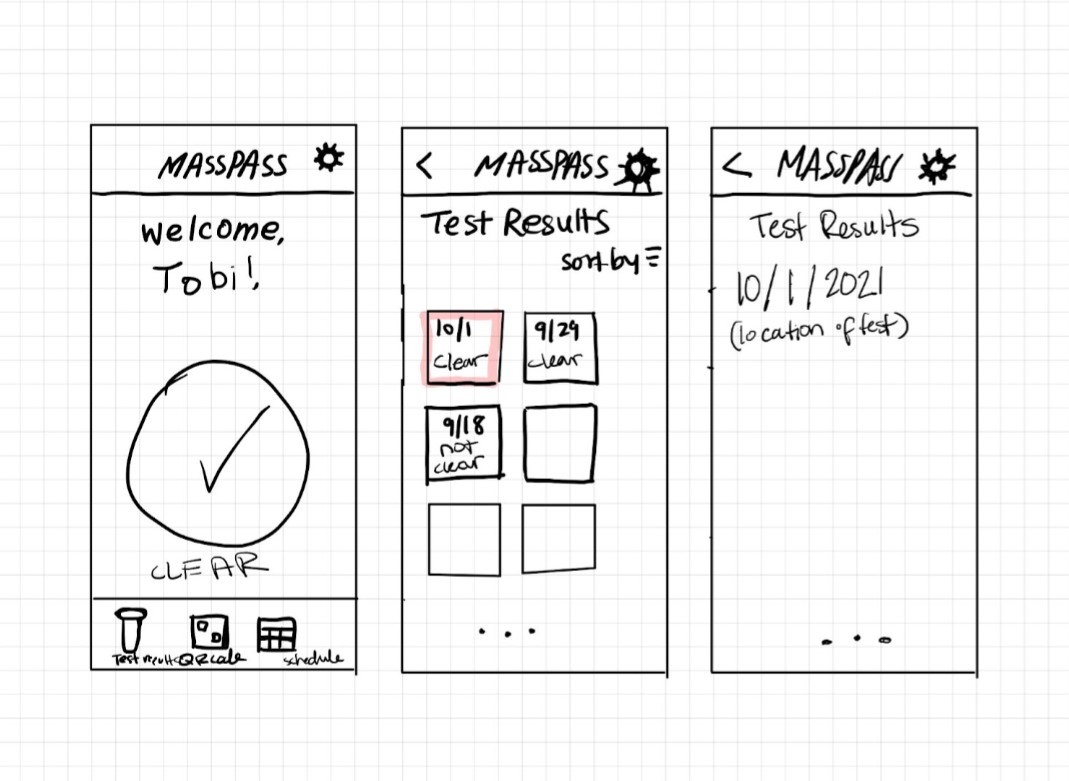
I sketched screens based on the COVID-19 related tasks interviewees commonly mentioned in their routines.
This task refers to users looking up the user’s PCR test results.
Scheduling a Test
Users can use the app to schedule a PCR test.
Users can view their proof of vaccination.


Ideation
Accessing Test Results
Displaying Proof of Vaccination
The usage scenario, Scheduling a test, is demonstrated in the video; Designed with Wireframe.cc.
low-fidelity prototype
I transformed the sketches into interactable wireframes.
Blue became the primary theme, following the Massachusetts style guide.
By adding more color, there was more contrast in the interface. Contrast helps guide users’ attention and makes information easier to understand.
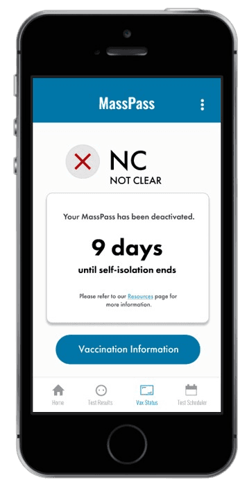
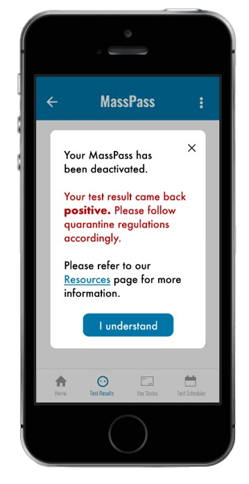
Deactivated Masspass modal
When a user tests positive, they’re informed about self-isolation, and their Masspass gets deactivated.
The modal aims to promptly alert users of their positive result and provide deactivation results.
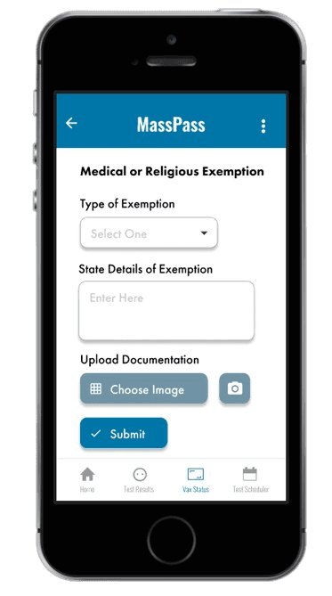
Exemption submission
Deactivated Masspass modal
Isolation period countdown
Testing positive for COVID-19 and self-isolating can understandably cause anxiety.
To help, a countdown was added for updates and resource links, guiding users through steps and expectations during this stressful period.
Deactivated Masspass - Vax status
These changes to the prototype were driven by personal knowledge as a designer and the application of newly learned design principles, including Gestalt’s principles.
Color scheme adjustment
I used my own insights to improve the interface in 3 ways.
High-fidelity Prototype
50%
of the time, deactivated Masspass notice went unnoticed by users.
The modal lacked emphasis, causing most users to close it before reading about their deactivated Masspass, hence in forgetting its details.
Majority of users reported that the general COVID-19 resources were well-hidden in the menu.
User feedback highlighted some UI and navigation challenges.
User Testing
I recorded my observations, tracking metrics such as the number of steps taken and the time taken to complete each task. After each task, participants were prompted to share their experiences with the Masspass prototype by completing a brief questionnaire, followed by a post-task survey.
58%
of users said locating the general resources was difficult.


Deactivated Masspass page
Optimizing positive test result notification flow
When users test positive, the first screen they see upon opening the app is a notice about the deactivated Masspass.
Users must now confirm that they have reviewed the on-screen information before proceeding.

Masspass tutorial
Adding a first-time user tutorial
Implemented an onboarding flow for new users, offering the choice to either skip or complete the tutorial.
2 major improvements to our design.
Design Enhancements
These changes resulted from user feedback regarding interactions with specific elements and their discoverability.

Masspass was a unique learning experience.
Reflection
I thoroughly enjoyed working on this project, especially because it coincided with the reopening of our university for in-person classes after a long period of remote learning. The COVID-19 pandemic impacted many of us, prompting adjustments to our routines, such as frequent testing. These circumstances made the experience of designing MassPass much more impactful.
In retrospect, I plan to approach future projects with these lessons in mind:
🧩 Enhancing Design Consistency through Components
One challenge we encountered was maintaining design consistency while working in a group and designing screens independently. Creating components or a design system could have helped us maintain a more cohesive design throughout the project.
🧑🤝🧑 Broadening User Demographics for Better Insights
We primarily interviewed users who were college students residing in the greater Boston area, which limited the diversity of perspectives. Testing with a more diverse group, including senior citizens, individuals who perform vaccination verification, and residents from different Massachusetts cities, could have provided us with additional insights and led to other design considerations.
Made with ❤️ by Kelly Dang, 2026

